Shopper POS
What’s Hot?
This issue of SPARK explores the recent increase in PoS (Point of Sale) promotional activity from brands across the Supers.
For anyone new to the game, Shopper Marketing is the focus on improving the consumer experience when shopping both in-store and online at the point of purchase, in order to drive sales.
PoS is a sub-set of the Shopper Marketing discipline and utilises physical media and displays to draw the attention of consumers towards particular products on the highly competitive shelves of our retail giants.
Typically, the options available to marketers include Headers, FSDU’s (Floor Standing Display Units), Barkers, Floor graphics, Flags and the takeover of gondola ends.
Following the government’s introduction of stricter HFSS (High Fat Sugar Salt) regulations, it has rendered many of the prime locations, such as gondola ends and till-point displays, out-of-bounds for a plethora of sweet treat and confectionary brands. This has lead retailers and brand owners to seek out other methods to capture shoppers’ attention, and after many years of reduced PoS - for a ‘cleaner store’ environment - we’re seeing increased activity once again.
Below are some examples of how Supermarkets and brands are activating in store:
ASDA
Terry’s and Fox’s are using ASDA’s mid-bay brand displays, to grab shopper attention. These are highly effective in capturing consumers’ eyeballs.
Meanwhile, the prime location of Gondola Ends is still in demand.
Sainsbury’s
Sainsbury’s currently offers a variety of mediums for promotional use including floor graphics, barkers and bay flags.
Shelf barkers are an effective way to communicate more in-depth information to the shopper and are usually displayed at eye-level to aid read-a-bility.
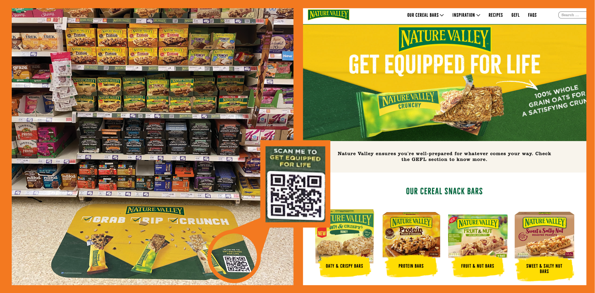
Floor decals are back with a bang at Sainsbury’s with dozens of brands deploying across the store.
Nature Valley are activating their ‘Get Equipped for Life’ campaign on floor decals adjacent to their fixture. QR codes take you straight to website and inspiration ideas.
Morrisons
Similarly, Morrison’s currently facilitates a large number of POS formats throughout the store.
This Kit Kat example shows the brand maximising its core assets – primary Logo, Red colourway, Snapping sticks and famous strapline… who could resist?
Tesco
Tesco continues to control PoS options with an iron grip! Choices for brands include mid-gondola take-overs with headers, or simpler shelf PoS takeovers
(See Red Hot examples below).
Waitrose
Waitrose offer a selection of engaging displays to enhance the consumer experience and draw attention at the fixture.
Author: Oli Webb
Bristol University Marketing Undergraduate
Work Experience at Threesixty, January 2024
Our checklist for Perfect PoS:
Keep content concise and relevant
Ensure messages align with core brand values
Use core brand assets for visual consistency
Consider QR technology to encourage brand interactivity
For your next retail project - from positioning to activation - please contact
We hope you enjoy this issue of SPARK.
See you next month!
Stay tuned…
Keep an eye out for the next edition of SPARK…
To discuss your next project, drop Jon an email: Jon@threesixtydesign.co.uk


