


Future Trends
At this time of year, there’s a swirl of trend predictions. It’s good fun thinking about what the year ahead will hold for FMCG brands and how they might activate to drive growth. I’m sure we’ll witness some brilliant campaigns.
A favourite of ours last year was Dove's Reverse Selfie. A beautifully directed and moving 60 second story encapsulating the pressures our children face to look perfect. This follows the positioning Dove has pursued over the past few years - keeping it real. The brand could create typical ads espousing product virtues but instead, this production and the associated online Self Esteem support resources create a truly distinctive brand proposition. View the advert here.
When it comes to packaging design, the challenge around trend is complex. Master Brand packaging needs to stay effective and relevant in the face of stiff competition from challengers. However, there is a danger in aligning packaging too closely to trends.
By their very nature trends have a limited lifespan and once it inevitably starts to wane everything associated with that trend starts to look tired. You don’t want to be reinventing your packaging every 12 months.
Our best guess is we’ll continue to see briefs that leverage hard-earned brand equity via dynamic and relevant line extensions inside and outside of core categories. Unilever’s Marmite are masters at this. In addition, we anticipate supporting a continued march towards true sustainability and 100% kerbside recyclable materials.
Finally, in an economy that’s creaking, we think our design model Be Seen, Be Desired, Be Understood will be more relevant than ever. With shoppers purses hugely squeezed, packaging will need to be best-in-class to help maintain and grow share.
Please include Threesixty on your next tender – we’d love to collaborate!

Adobe releases it’s 2023 creative trends report
This year, Adobe has called out four specific trends…

Psychic Waves is a response to people looking for inner wellness. Brands have been projecting what that looks like, but ‘Psychic Waves’ focuses on how wellness actually feels. Influences include otherworldly, shiny graphics, astrology, and spiritualism. The goal is to create a sense of serenity and calm within ourselves.

Real is Radical goes against the polished, Instagram-ready, heavily filtered look with a more candid approach that captures authenticity. ‘Real is Radical’ abandons conventional notions of perfection and beauty to curate a more inclusive and realistic worldview.

Animal and Influencers reflects the popularity of our cute, furry friends online and content creators that use animals / anime to cultivate a persona that resonates with followers. With rising pet ownership prompted by the pandemic, our love of animals, and animal-related content, has grown.

Retro Active details our fascination with the late 90s / 00s as a designinfluence. Most younger consumers aren’t old enough to remember this time in history, but they’re enamored with the looks and relics of the era. Low-rise jeans, flip phones & rainbow-like color palettes are a hit with Gen Z.
Source: The Dieline
Author: Rudy Sanchez
Unboxing Tomorrow: Dieline’s 2023 Trend Report

Groovy Feels. This instantly recognisable aesthetic is giving us a trip through the 60s & 70s.

Literally “Literal” Typefaces. Quirky, imaginative letterforms are all the rage.

Not-So-Simple Wordmarks. These wordmarks say more with less and beg you to read between the lines.

Inspired Regionalism. Enough to evoke the feelings of a place but not enough to look like tourism swag at a souvenir shop.

Collage Core. Brands are creating surreal designs - turning packaging into a vibrant canvas with collage techniques.

Stickermania. Brands are leaning more and more into the quirky, playful appearance that stickers can give.
Source: The Dieline
Author: The Dieline

2023 Pantone colour of the year...

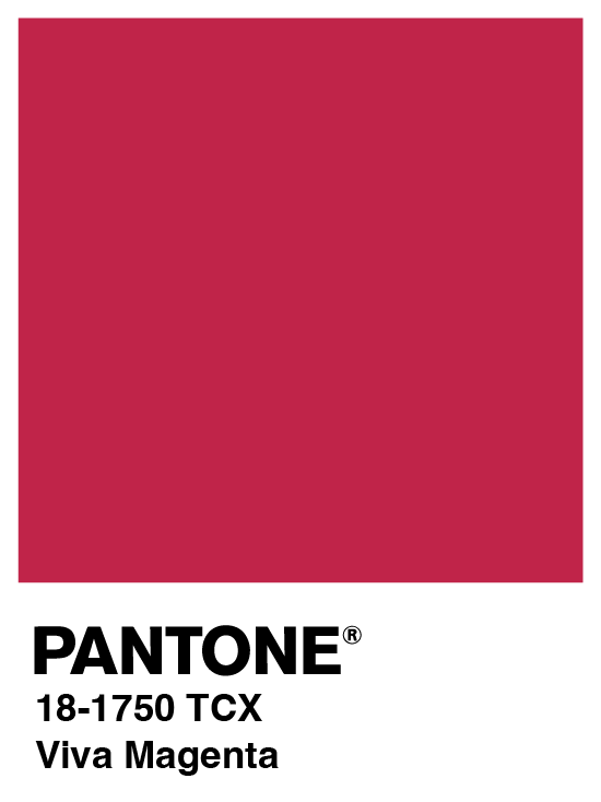
Viva Magenta vibrates with vim and vigor. It is a shade rooted in nature descending from the red family and expressive of a new signal of strength. Viva Magenta is brave and fearless, and a pulsating color whose exuberance promotes a joyous and optimistic celebration, writing a new narrative.
This year’s Color of the Year is powerful and empowering. It is a new animated red that revels in pure joy, encouraging experimentation and self-expression without restraint.
Source: Pantone


M&M’s reveals global redesign alongside new brand purpose.
The new identity design by JKR emphasises the logo’s ampersand, coinciding with the brand’s push to show progressive ideals.
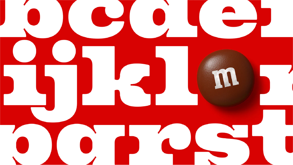

Source: Creative Review
Author: Megan Williams
A playful new visual identity for Pret
The new branding is designed to be “freshly-made” for the digital age and comes as the café chain expands into new markets.

Source: Creative Review
Author: Aimée McLaughlin
The Olympic brand gets a refresh
Canadian agency Hulse & Durrell and the International Olympic Committee led the redesign of the overarching Olympic branding, as part of an ongoing process to evolve its design system.


One of the core aims has been to bring consistency across all touchpoints, particularly in digital contexts, to ensure the Olympic brand comes across as “relevant and credible”.

Source: Creative Review
Author: Megan Wiliams

Veganuary 2023 preview: from This bacon to spicy nuggets
Veganuary has become the key time for brands to bring out their plant-based NPD. So which new products are set to hit the shelves for Veganuary 2023?

Source: The Grocer
Author: Charles Wright
New Product Development!
OaYeah will debut with two products made with oat milk: a six-pack of Original crepes and a four-pack of ‘American-style’ Fluffy pancakes.

Source: The Grocer
Author: Niamh Leonard-Bedwell


Design in 2023 – what will packaging design look like this year?
In 2023, I believe we will continue to see brands succeed by tackling two things.
Firstly, by challenging the traditional category codes associated with FMCG brands and evolving towards a more contemporary, sometimes rule-breaking approach.
There are particular FMCG categories with outdated codes, and brands such as Nice Cream, Burgen, Border Biscuits, Waken and Plenish have all simplified to amplify, rapidly changing our perception of embedded approaches. Gen Z are looking for fundamentally different aesthetics and values to those of other generations. Brands must stand out, and for the right reasons.

Secondly, we hear every day about how our world is congested and fast-paced. The FMCG brands that are simple and bold are the ones that will stand out. The well-embedded phrase ‘simplify to amplify’ is becoming more and more poignant as our worlds become increasingly sensorially congested. Brands need to carefully and strategically remove the usual clutter of busy, over-packaged products with overloaded listings of ingredients, benefits and promises, and focus on making the product speak for itself – by peeling away what is irrelevant to sharpen the brand down to its true essence on the packaging, both visually and physically.
The Ecover brand had always sought to be a category-changing pioneer but had gradually overloaded its label with too much information. The new design is vibrant and striking on shelf with simple information and a bold and confident personality. It’s a perfect example on how to maintain your leadership position by being brave and true to a clear brand purpose.
Source: Design Week
Author: Sophie Tolhurst

Stay tuned…
Keep an eye out for next month’s edition in February…
To discuss your next project, drop Jon an email: Jon@threesixtydesign.co.uk
