Hovis Farmhouse
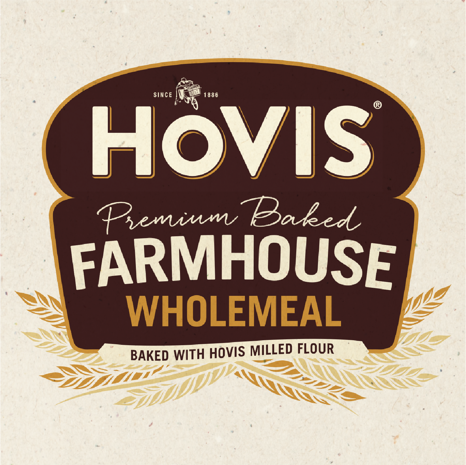
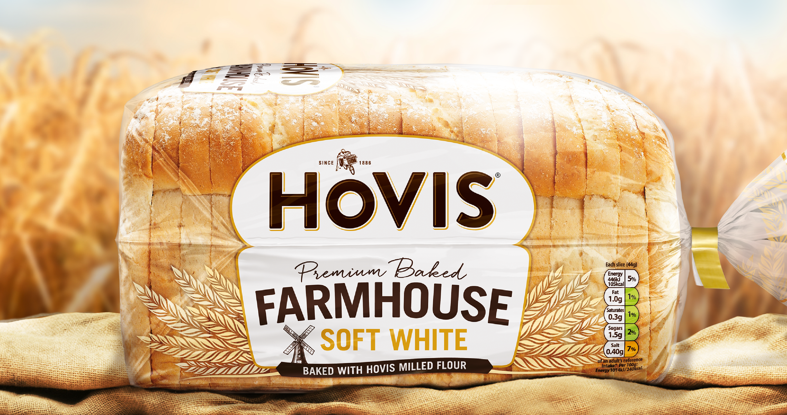
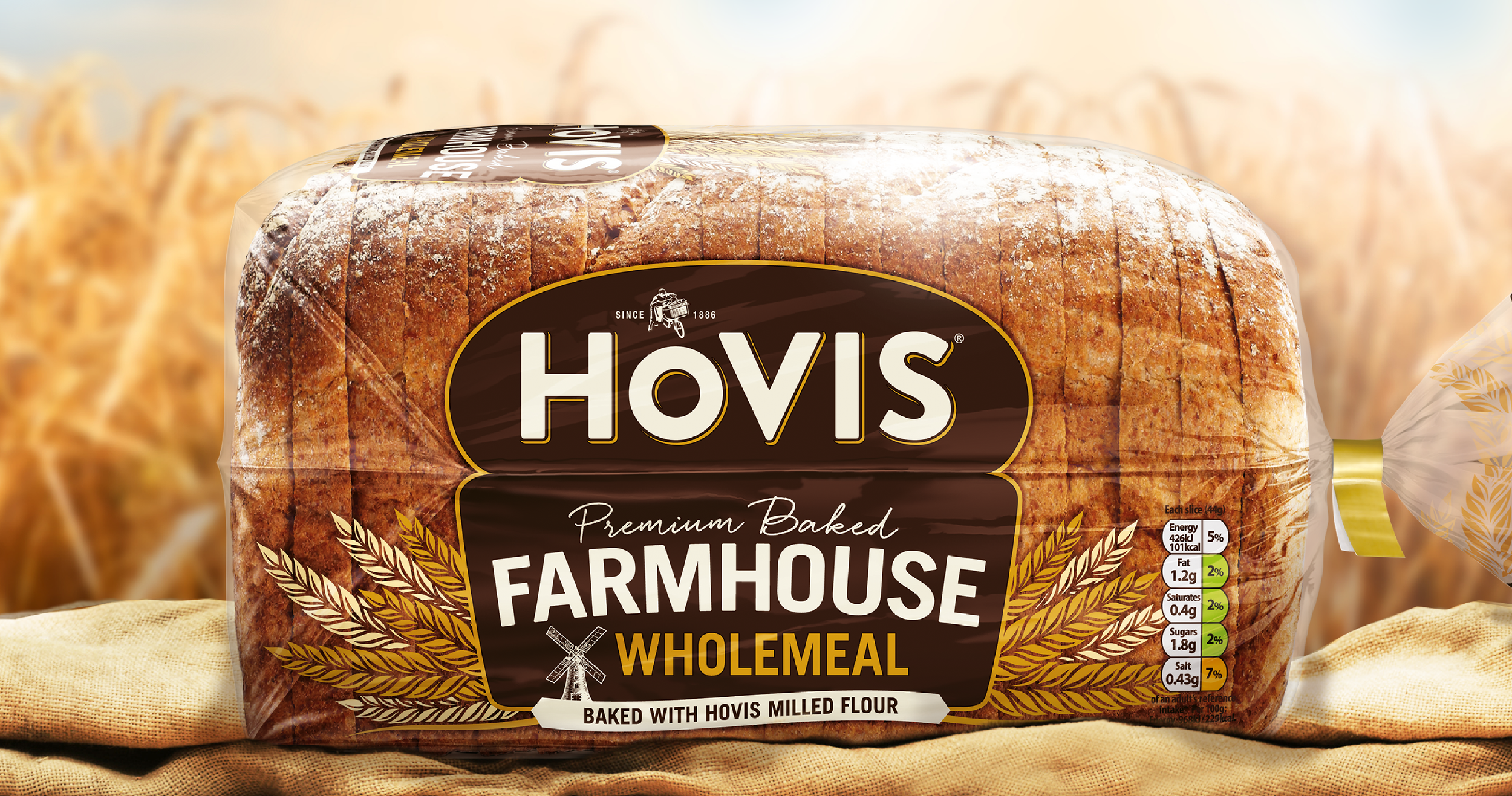
A ground-up redesign for this most premium of Hovis loaves.
Building on the fresh brand proposition, our designs reflect the heritage and quality-eat for this traditional farmhouse loaf.
The clear material celebrates the quality bake while the wheat motifs celebrates the craft in every loaf.
Colour helps define the two variants while the elegant typography helps support the proposition. This is the best of the best.
"Threesixty are great to work with. They always work to the brief, and then go on to deliver more and stretch the potential of the idea. They present routes in competitive context and show a really good understanding of the retail environment.”
Sharon Barraclough,
Marketing Director


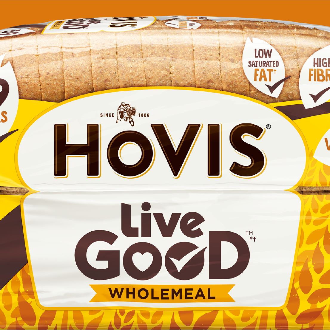
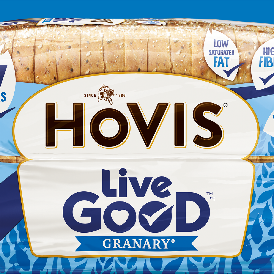
Hovis Live Good
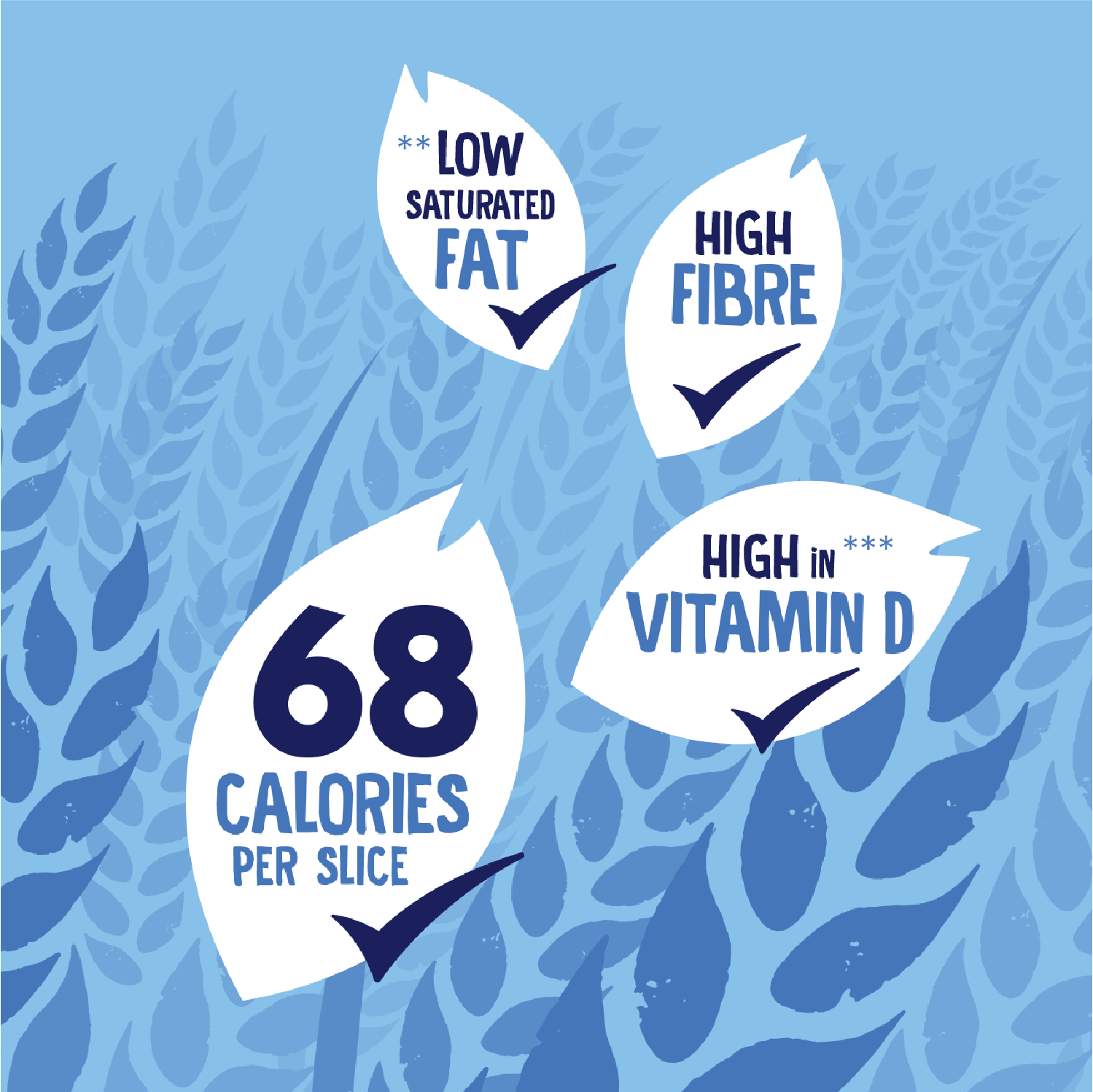
Carefully selected ingredients deliver the same Hovis taste with lower calories, while being both high in fibre and vitamin D.
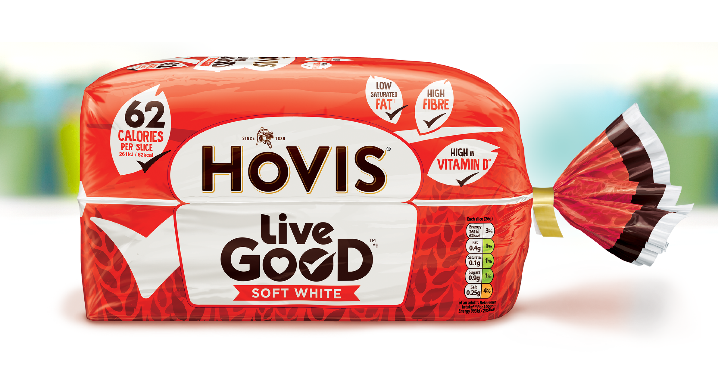
Naming, design and illustrations created by Threesixty. Our ‘tick' motif quickly signposts the healthier eat.
It’s all good. Live Good.
Hovis Bakery
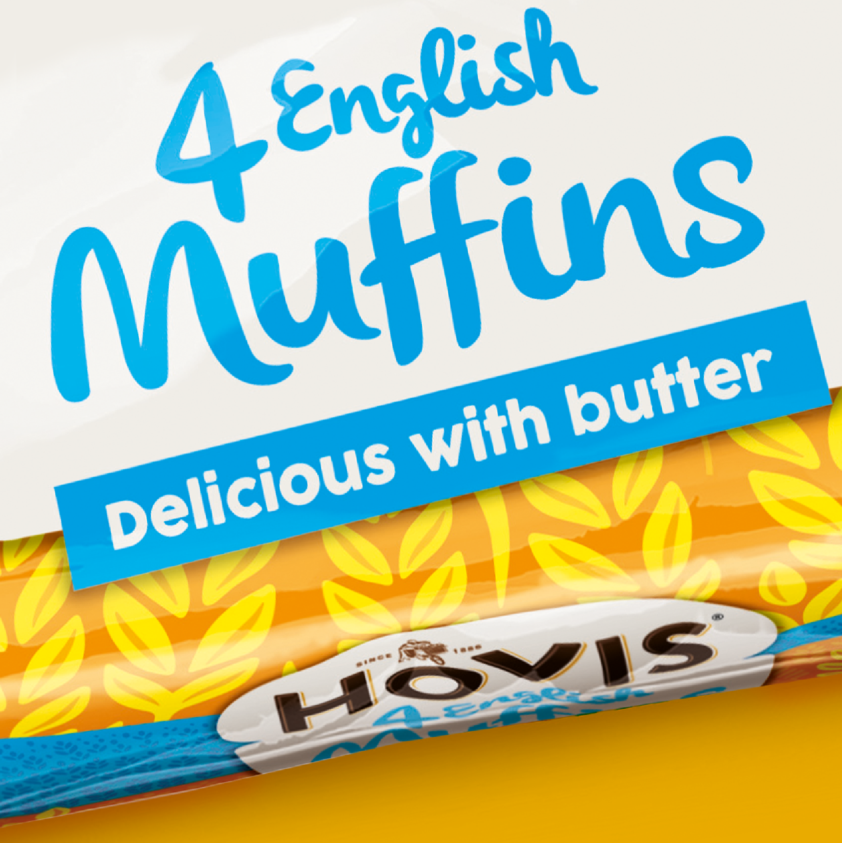
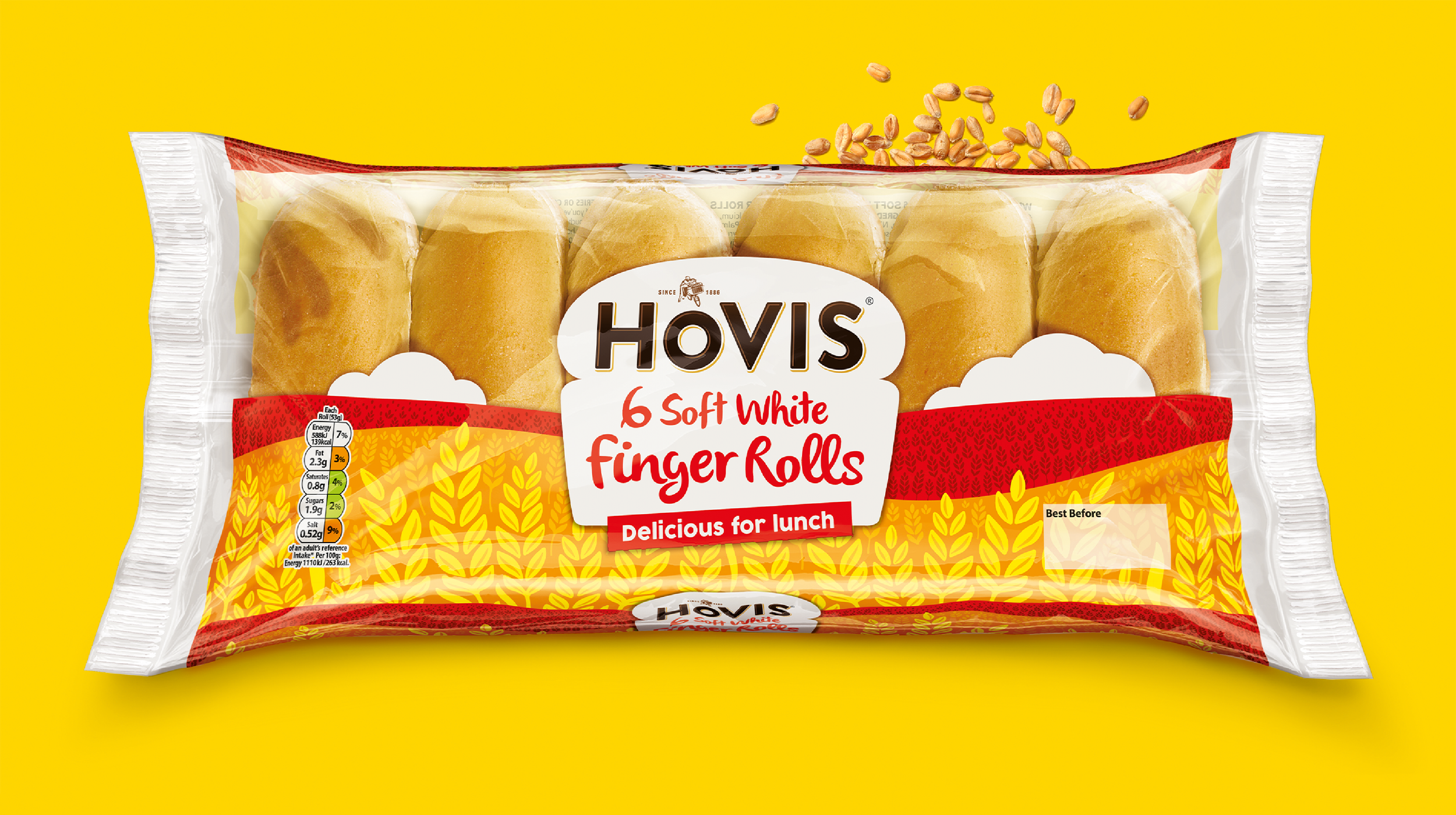
A brief to ensure that Hovis morning goods pop energetically at the fixture.
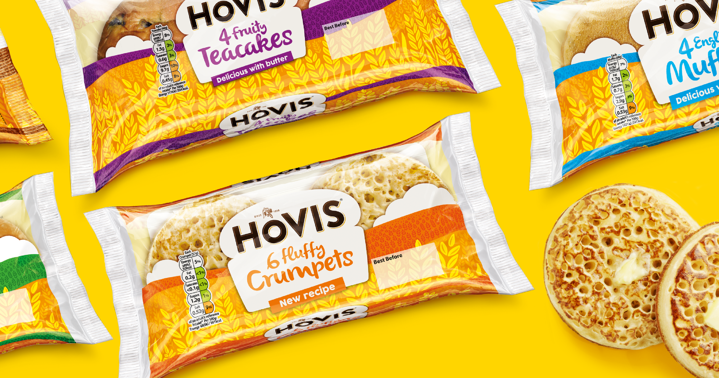
Designed to work hard as a range while capturing the key value drivers; quality and craft. The optimistic and uplifting clouds lead down into flavourful fields of wheat and colour helps differentiate with ease.
“I love teacakes, the purple ones!” “I love pancakes, the green ones!”
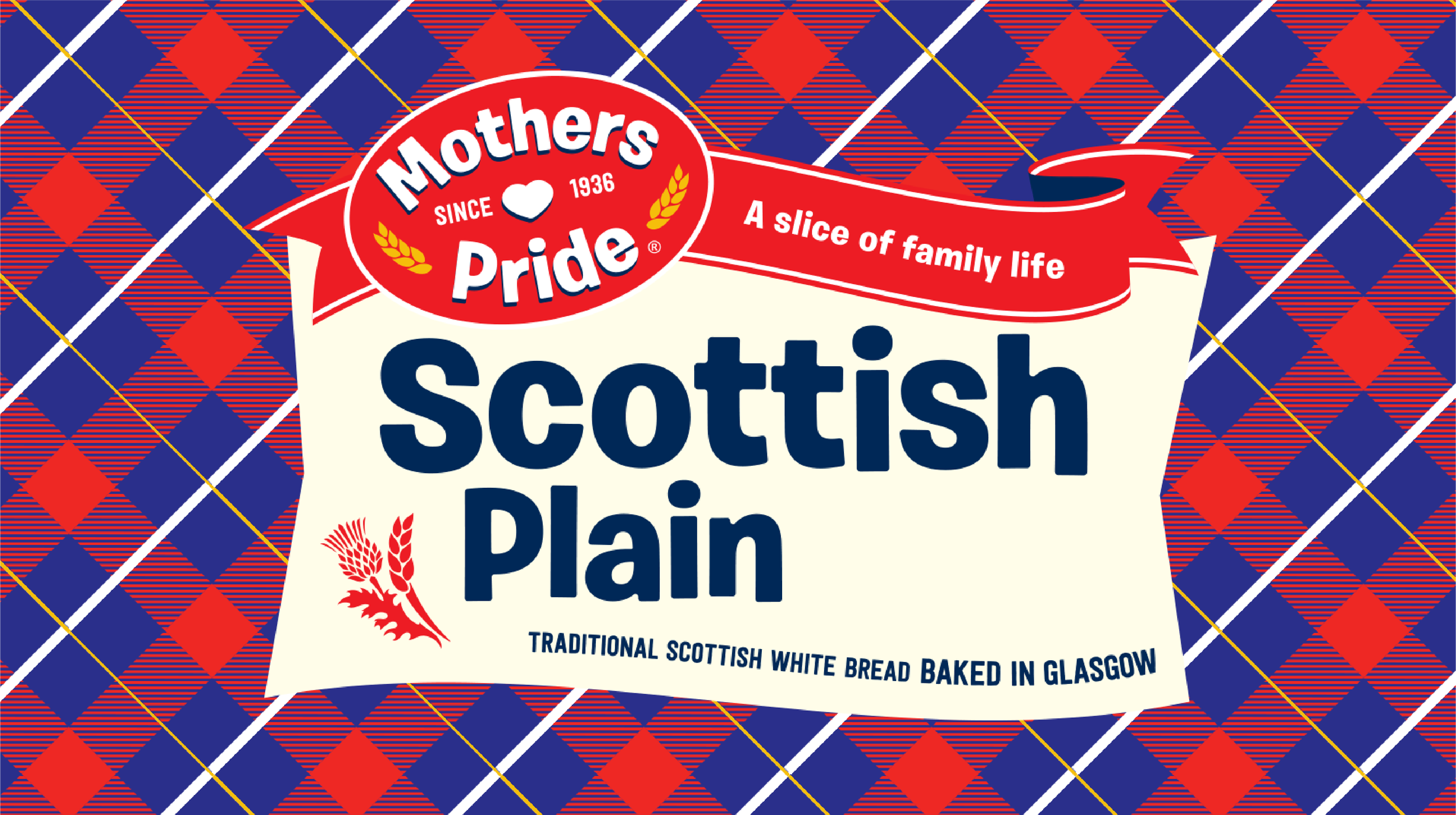
Mothers Pride
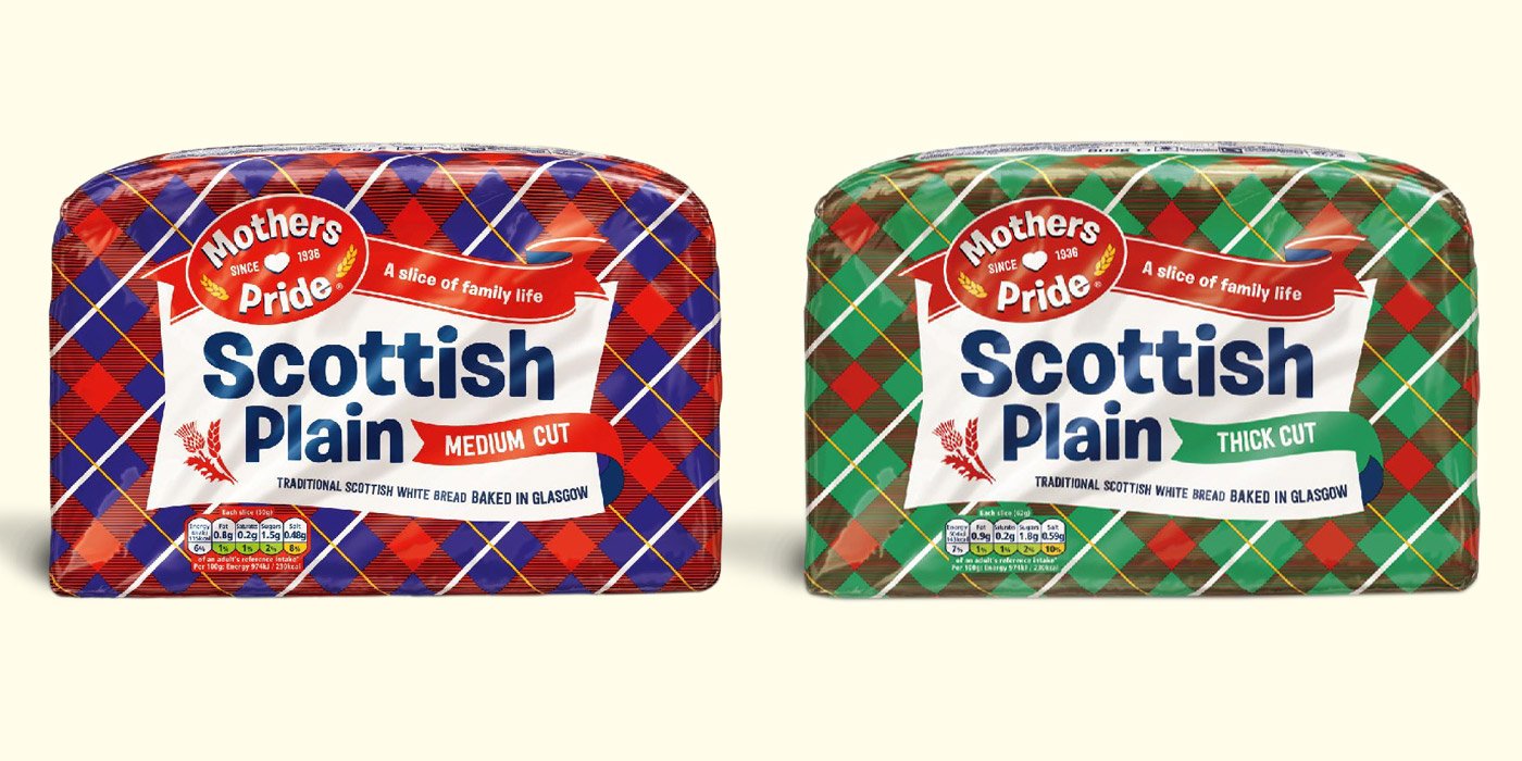
A wholly new Brand logotype, revisions to the tartan pattern, illustrations and typography all help freshen up this Scottish Icon.

